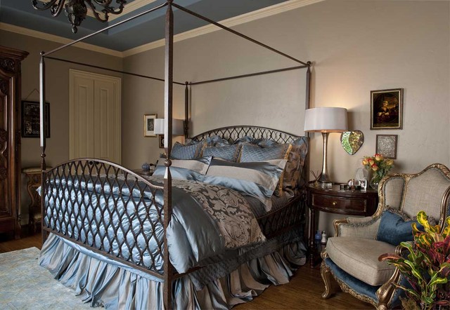
Hello guys and gals! Welcome back to another Sunday blogging. Keeping up with my series of lavish celebrity styles, today we're going to take a look at some of them most lavish homes celebrities have.
First is Celine Dion. Dion is an award winning singer who is famously noted for her song "My heart will go on" which was played in the movie "Titanic". With a large angelic voice comes a large angelic house for Dion. Dion's home in Jupiter, Florida is custom built and is almost like staying at a resort in the Bahamas.
Next is Bob Hope. Bob Hope is a comedian who was dedicated to to work for 80 years before he died at the age of 100! As a comedian you couldn't expect hope to have a mediocre home.
This is Bob Hope's "Volcano House" which even opens at the center and allows a 360 view of the night sky. Watching stars from the ceiling of a home is pretty convenient, don't you think?
Lastly there's Wilmer Valderrama. Valderrama is an American actor, singer and producer who is mostly known for his comedic role in the sitcom "That 70's show". Valderrama now made it onto this list as having one of the most lavish homes in Hollywood.
This estate includes 2 housing units, a multipurpose building, sports facilities, and a pool and spa that are to die for with their beach entry. This is definitely no 70's home.
hope you guys enjoyed today's blog and remember if you want a room specifically designed for you just leave me a comment and I will definitely get to you. If you would like me to add more designs each week let me know in the comments as well. Do you imagine yourself in one of these beautiful homes?Know any homes that look similar? Let me know.
Monday, May 8, 2017
Sunday, April 30, 2017
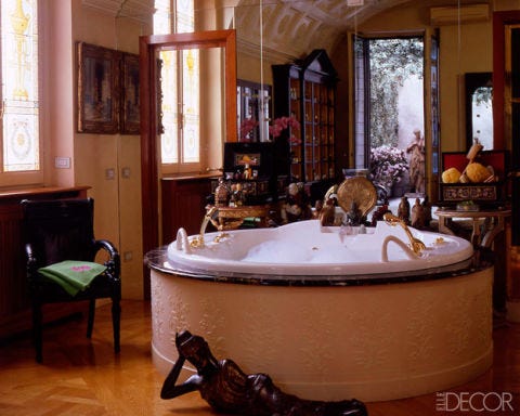
Hello guys and gals! Welcome back to another Sunday blogging. Today I'm going to talk about bathrooms. We spend a great deal of time in bathrooms. We shower, wash our hands, get dressed, and excrete waste in them. Bathrooms in modern times have been designed in lavish, Who said we can't poop in luxury. Bathrooms are an essential part of our everyday lives and we must take care of those as well. Today we're going to be looking at some insane celebrity bathroom designs.
First is Hilary Swank. Swank is known for her inspirational role in the movie "Freedom Writers" which is also one of my all time favorite movies. Swank has one of the most luxurious bathrooms that is made just for her Manhattan Apartment.
Next is Donatella Versace. Donatella is the artistic designer for the Versace design group which is one of the most popular design groups in the world. Being an artistic designer no one should've expected a mediocre bathroom from her.
Last is Ralph Lauren. Ralph Lauren is a multi-billionaire who is knows for his clothing line "Polo". He and his wife Ricky Lauren have made a nice lives for themselves and reside in their Manhattan apartment which also happens to home one of the most luxurious bathrooms in the country.
hope you guys enjoyed today's blog and remember if you want a room specifically designed for you just leave me a comment and I will definitely get to you. If you would like me to add more designs each week let me know in the comments as well. Do you imagine yourself in one of these fashionable bathrooms? Do you have a space that looks similar? let me know.
I will see you guys next week with another Sunday blog.
Hello guys and gals! Welcome back to another Sunday blogging. Today I'm going to talk about BABIES! Babies also need their rooms right? Lately many babies have been getting stylish rooms all to themselves and it's become quite a trend. Celebrities such as Tamera Mowry-Housley, Kourtney Kardashian, and Tori Spelling all have crazy fashionable nurseries just for their little ones. As we move into a time of fashion our newly welcomed generation also gets introduced to the fashion which leads to these luxurious nurseries.
First is Tamera Mowry-Housley. Housley is known for being on the hit tv series "sister,sister" alongside her twin sister Tia Mowry and for her work on the daytime talk show "The Real". When it came to designing a nursery for her daughter Ariah, Housley went above and beyond.
Next is Kourtney Kardashian. If you've never heard of Kourtney Kardashian you must have been living in a cave. The Kardashian family is everywhere is famously noted for their hit show "Keeping up with the Kardashians". Since Kourtney is constantly in the spotlight you wouldn't expect anything less from her when it comes to designing a nursery for her little one. Kourtney has gone with the "Pretty in Pink" style for her daughter Penelope.
Last is Tori Spelling. Spelling is widely known for being on the hit tv show "Beverly Hills 90210" and also her own reality tv show "Tori and Dean: Home sweet Hollywood". Spelling decided to go with a vintage styled nursery for her son Finn Spelling. The room has vintage styled furniture with lots of pops of color.
hope you guys enjoyed today's blog and remember if you want a room specifically designed for you just leave me a comment and I will definitely get to you. If you would like me to add more designs each week let me know in the comments as well. Do you imagine yourself or one your babies in one of these spaces? Do you have a space that looks similar? let me know.
I will see you guys next week with another Sunday blogging.
Friday, March 31, 2017
Hello guys and gals! Welcome back to another Sunday
blogging. Today I have three new amazing and beautiful designs. Today I want to
show that simplicity can actually make a room or space look very nice. A lot of
people assume that to make a space look nice there has to be lots of different
elements that can look nice together. This isn’t the case at all, to make a
room look nice all you need a nice organized structure that flows throughout
the space no matter how simple or full it is.
In this first design I just used three colors: White, pink,
and purple. The colors all flow together from the pillows to the roses on the
coffee table. The design would remind someone of a vacation trip to Bora Bora.
The scenery in the background fits the design very well and compliments the
bright colors.
This next design is a bedroom. With this space I decided to
simplistically use a pattern. In this bedroom the main pattern is leaves, red
leaves that is. The red leaves are the signature piece of the room. They keep
the room unified. I challenged myself with this as I designed the room around
the art pieces.
hope you guys enjoyed today's blog and remember if you want
a room specifically designed for you just leave me a comment and I will
definitely get to you. If you would like me to add more designs each week let
me know in the comments as well. Do you imagine yourself in one of these
spaces? Do you have a space that looks similar? let me know. I hope you guys
enjoyed today’s lesson on simplicity.
I will see you guys next week with another Sunday blogging.
Sunday, March 19, 2017
Hello guys and gals, Welcome back to another Sunday blogging. continuing with my series, today I have some new designs for you all.
This first design is an elegant living room design. I love having purple as an accent color as it has a sense of royalty and it's a color that overall has a calming tone. The black helps the purple stand out and it pulls the room together.
Next is a simple kitchen design. I kept thinking design very mellow as there are people who prefer a much blunt design that doesn't have too much color. I also like a room that is just solid and together. Some people may find these types of designs boring but I honestly think that they are unique and slightly fun.
This next design is a something new I wanted to add. It's a poolside design that screams the vacation dream. I absolutely love the striped pillows and the mini palm trees to really tie in that West coast vacation vibe.
I hope you guys enjoyed today's blog and remember if you want a room specifically designed for you just leave me a comment and I will definitely get to you. If you would like me to add more designs each week let me know in the comments as well. Do you imagine yourself in one of these spaces? Do you have a space that looks similar? let me know.
I will see you guys next week with another Sunday blogging.
Sunday, March 12, 2017
Hello guys and welcome back to another Sunday blogging. As I mentioned before I have started a new series and today I have some new designs for you all.
This first design is a bright colored living room. I liked it a lot because it kind of reminded me of New York. It has a Manhattan vibe. It's chic and simple and looks great within the small space. The brick wall allows more color to show without being distracting. Every pattern complements each other and doesn't take away too much from each other. The three basic palette colors are red, white, and black but the patterns keep them from looking too matte
This second design is a chic living room. The gold is a nice accessory color that really gives the room a sense of elegance. The blue is a color that can stand out yet keep the room in unison. I absolutely love using blue as an accent color simply because it's a color that can blend well with others. The blue goes well with the gold, black, and white.
I hope you guys enjoyed today's blog and remember if you want a room specifically designed for you just leave me a comment and I will definitely get to you. If you would like me to add more designs each week let me know in the comments as well. Do you imagine yourself in one of these spaces? Do you have a space that looks similar? let me know.
I will see you guys next week with another Sunday blogging.
Sunday, March 5, 2017
Hello guys and welcome back to another Sunday blogging! I know I've been gone for a while but I'm back and I have a huge announcement. I've been working on a new series where I actually display my own designs. I constantly talk about how to do certain DIY's and crafts but I've never shown how I implement these into my designs, so now I want to show you guys how I work and what I do.
With this first design I decided to actually be bold and not be afraid to use color. I actually love how the colors complement each other and fill the room. The white in the room isn't distracting so all of the colors get to pop.
With this second design I decided to go a much simpler route. This room is perfect for anyone who just wants to rest. The yellow against the black shows happiness and calms the mood of the room even though it's bright. The greys blend well together and keep the room unified which can signify a very focused and driven individual.
I really hope you guys are enjoying this series so far. I will definitely have more for you guys Everytime and if you have suggestions for room decor or color leave a comment below. Also, let me know how you feel about these designs. Do you see yourself living in one of these spaces? Do you see someone else living in these spaces?
Thanks for reading looking at today's blog and I will see you all next Sunday with another Sunday blogging.
Friday, February 10, 2017
Hello guys and welcome back to another Sunday blogging. As
you guys know it is February which is also Black history month. To celebrate
the African American heritage I want to take a trip down memory lane and talk
about two African American figures that have influenced architecture in big
ways..
First, I want to talk about Paul Revere Williams, who was
the first African American member of the American Institute of Architects(AIA).
Paul Revere Williams was born on February 18, 1894 in Los Angeles, California.
Williams experienced little prejudice since California was pretty well
integrated although he was the only black student in his Elementary school.
Even though he had little prejudice he still had his struggles when becoming an
architect. Williams never gave up on his big dream and became a licensed
architect in 1921. Williams has designed homes for so many big names such as
Bill “Bojangles” Robinson and Frank Sinatra.
The next person I want to talk about is Norma Sklarek who
was the first African American woman licensed as an architect in the United
States. Sklarek was born on April 15, 1926 in Harlem, New York. Sklarek
attended an all-girls magnet school where she gained a love for the arts,
science, and math. She made sure to reach her goal by attending Columbia University’s
school of Architecture. Sklarek breezed through her classes and shocked
everyone when she passed her final licensing exam on the first try. Sklarek moved to L.A to make her dreams become
reality and in 1980 Sklarek became the first African American to receive a
fellowship by the American Institute of Architects.
Hope you guys enjoyed this information today. Remember to always make history for yourself and keep being the architects I know you are.
Friday, February 3, 2017
Hello guys welcome back to another Sunday Blogging (even
though it’s Friday).
Today I’m going to be speaking on a totally new form of architecture. I’m
talking about Floating Cities! This new phenomenon has come up to prevent
flooding within cities. It has taken the world by storm and has even been described
as what can save humanity.
The Seasteading Institute has been conducting research for
five years to figure out exactly how these cities will function in the real world. The plan has been to use the territorial waters
of an existing nation such as the United states to make sure the cities can remain where they are without any hassle. The researchers are now looking for a host nation to
start with as it’ll be more cost efficient and it will become popular since
residents are already in the nation and will have a way to easily travel to the
newfound city. A host nation can also provide good legal framework which will
make the process of building the city much easier.
Researchers have also been trying to find ways to make the
city beneficial for the host nation such as trying to find a way to create jobs
for economical exchange to help with substantial political independence.
Researchers have concluded that the first floating city may be established in
2020 which is pretty soon.
I personally believe that this is great idea simply because
it expands human territory which gives humans better chances of not only
survival but of living skills. A lot of countries such as Japan and China have
so many people in their countries that they regulate their population to
prevent overcrowding. Building these floating cities can reduce the need of population
control. The floating cities will allow us to learn more about the world and
how we can change it for the better.
Hope you guys found today’s blog interesting, and please
feel free to look more into it yourself at https://www.seasteading.org/floating-city-project/
Sunday, January 29, 2017
Hello guys and welcome back to another Sunday Blogging. As
you guys know February is approaching really soon which means Valentine’s day
is approaching as well. Today I am going to be showing you some Valentine’s day
home décor hacks. By the way these help whether you’re single or coupled up
with that special someone.
This first hack is a simple classic Valentine’s day heart. All
you need is a strip of paper. Take the strip of paper and fold it in half from
the middle. With both open ends curl them inwards towards each other (to make
the process easier you can use things such as pens, markers, and pencils to
make defined curls on the ends).
This next hack will give you a nice subtle design for a jar.
Simply use decorated tissue paper and glue it onto a jar. Gluing tissue paper (mainly
white) can cause it to become transparent creating a cool effect. Add a candle
into the jar and it will for sure make a nice home decoration.
A lot of people prefer to be simple on Valentine’s day which
is respected especially in this day and time where a lot goes on. For those
simple people who like Valentine’s day but don’t have any time to do anything
fancy you can just go with the classic construction paper hearts. Just
literally cut the construction paper (preferably colored red, pink, and white)
into the shape of hearts. This is simple and can just be used as table
decoration or glue it onto a sheet of paper making a nice heart collage. You
can even cut them into different sizes to make it more fun.
Hope you guys enjoyed these hacks and use them to make yours or someone else's Valentine's day very special. That's it for today and I hope to see you guys once again next week for another Sunday blogging.
Monday, January 16, 2017
Hello guys welcome back to another Sunday blogging. First, I
want to say that I’m happy to be back in business and most of all HAPPY NEW
YEAR!!! Today we are going to be discussing how you can learn to become a pro
at interior designing. It’s now 2017 and our ideas of interior design are
changing drastically. So, to help you keep up with the times, I want to give
you some tips on how to be a pro or at least look like a pro when it comes to
interior design.
First, you need to know how you want your home styled. Do
you want your home to be modern, vintage, shabby chic or etc... Knowing how you
want your home designed is the first step because now you’re able to design around
that category.
I personally love modern homes. I absolutely love tones that
are more earthy and don’t draw too much attention. Modern is classy and very relaxing. You can simply never go
wrong with a modern look.
Secondly, know what colors fit you so that way when you
possibly have guests over the colors fit your personality which make you feel
comfortable eventually leaving your guests feeling comfortable as well.
I’m a very calm, cool, and collected person so my favorite
colors are beiges, dark browns, and dark blues. They set a calm tone and they
aren’t crazy colors, and lastly, they blend well together to make a room look
like a nice safe haven.
And lastly, make sure your furniture matches everything
else. Furniture honestly is the most fun part of designing as there are so many
variations of it. While choosing furniture it’s always fun to mix some things
up. I’ve always liked the vintage style combined with modern simply because
they do share some similarities and balance with each other.
I hope you guys enjoyed today's blog and most of all I hope you apply these basic skills into your everyday designing. It's the New Year, time to make a New Year's resolution and take control of your home.
Subscribe to:
Posts (Atom)